
Hi, I’m Bruce.
That’s me, hovering at depth in the Philippine Sea.
Not on vacation - just doing my job.
What do I do?
I shape meaningful ideas through design, story and experience.
It doesn’t always require a wetsuit. Most days, I’m wrangling Zoom - not neoprene.
DESIGN CASE STUDY
Canada Rise
A visual rally cry for a nation ready to lead with heart.
“With glowing hearts we see thee rise” and "Ton histoire est une épopée" written in both national languages - inset on a circle - uniting all cultures, over the natural beauty of our beloved land. A iconic symbol of our proud heritage, and our bright future. Originally developed during Canada’s 150th, this mark was designed to capture more than just a milestone. A mountain range for resilience, a compass pointing to true north, and a maple leaf held in the negative space. And now years later, it takes on renewed meaning.As the world grows more fractured and uncertain, Canada Rise serves as a quiet call to unity, a reminder of what we stand for, and how we show up. Not just as Canadians, but as global citizens. Generous in spirit. Committed to each other. Anchored in community and open to the world.This case study explored how design can celebrate our values. Not to sell patriotism, but to ground it in purpose.

Recent events also sparked the inspiration for a children’s story about courage, community, and standing up for what matters - featuring Buster Beaver (pictured above).
Look out for Buster & Guy: Defend the Pond, currently in development.
BRAND CASE STUDY
Flavour Harvest
A multisensory brand experience designed to shift the way people relate to food, flavour, and community.
Commissioned by the Canadian Centre for Food & Ecology (CCFE), Flavour Harvest is a taste-first public engagement campaign designed to drive behaviour change around local food grown in living soil. From naming and identity design to strategy and messaging architecture, I built the foundation for activations that meet people where they are - and surprise them with just how good local food can taste.


The brand is playful, bold, and sensory-driven, combining macro food with casual, human-first language to make nutrition and sustainability feel irresistible. Every touchpoint - digital, physical, and experiential - was crafted to move people from curiosity to connection, one ridiculously good bite at a time.
To extend the experience online, I developed a social campaign built around short, snack-sized quotes that capture the moment someone tastes something surprisingly good and suddenly feels a connection. Each line reflects the heart of the experience: curiosity, flavour, and unexpected joy. It’s not a sell, it’s a glimpse into how the experience makes people feel. The series is designed to grow with real quotes, video, and audio from local artists - all taken from the actual experience of Flavour Harvest.
BRAND CASE STUDY
Canadian Centre for Food & Ecology
A foundational brand system for a national non-profit at the intersection of food, community and ecology.
In 2023, I led the full identity development for the Canadian Centre for Food & Ecology (CCFE) - a new national organisation working to transform our relationship with food, land, and each other. The brand was built from the ground with the purpose of inspiring food decisions that nurture people and planet. At its core is a unifying visual form - the leaf - used to create a versatile system that supports sub-brands, bilingual communication, and everything from policy reports to public engagement.
Brand Abstract

The foundation of the CCFE identity is a brand abstract that articulates its philosophical core. Built on the principle that change is a journey, the CCFE brand is designed to hold complexity without losing clarity. It celebrates food not just as sustenance, but as story - connecting people to land, to culture, and to each other. It affirms food as a basic right, centres traditional knowledge alongside innovation, and reflects nature’s truth that everything is connected. These guiding ideas were not just expressed in words, but translated into the tone, structure, and visual language of the brand system.
Custom Typeface

The identity system includes a custom typeface called Leaf, designed with a modular visual language built to support sub-brands and real-world activations - like the Carrot Cart, a mobile tasting station where people could pull a carrot from soil, wash it and eat it on the spot. A simple, joyful moment that brings the mission to life.

ADVERTISING & DESIGN CASE STUDY
Wasaga Beach Identity
A complete overhaul of the Town of Wasaga Beach Brand and Communications.
In late 2022 I approached the Town of Wasaga Beach with a vision for integrating the town’s disjointed family of logos. Unprompted, I proposed a revitalized identity that echoed the town's roots while infusing a modern vibrancy. A perfect blend of heritage and tourism allure.This project went far beyond a mere logo replacement; it's a meticulous blend of refinement, modernization, and seamless integration of pre-existing elements, colours, and brand equity. It included strategic development, design, writing, advertising, wayfinding, event promotion and merchandising.
Events


In addition to the brand identity, I also supported the events team with advertising and design. Here's a few examples (above) from some of their key events. I also created Canva templates for the social media teams to share in various formats.
Tourism


Here's a snapshot (above) of some of my work for the tourism group. My goal with all aspects of the creative for the Town of Wasaga Beach was to lift it from what you would expect from a small town and treat it like a world class destination.
Wayfinding & Signage


One of the town's biggest problems is deteriorating signage and the lack of information to help tourists (and locals) find their way around or get timely information about beach reservations/rules. I was asked to evaluate a pre-existing wayfinding study and propose how the new identity could adapt the physical and digital landscape to become more progressive and helpful. These images (above) are just a taste of those recommendations.
ADVERTISING CASE STUDY
UN Women
A digital and outdoor campaign for International Women's Day.
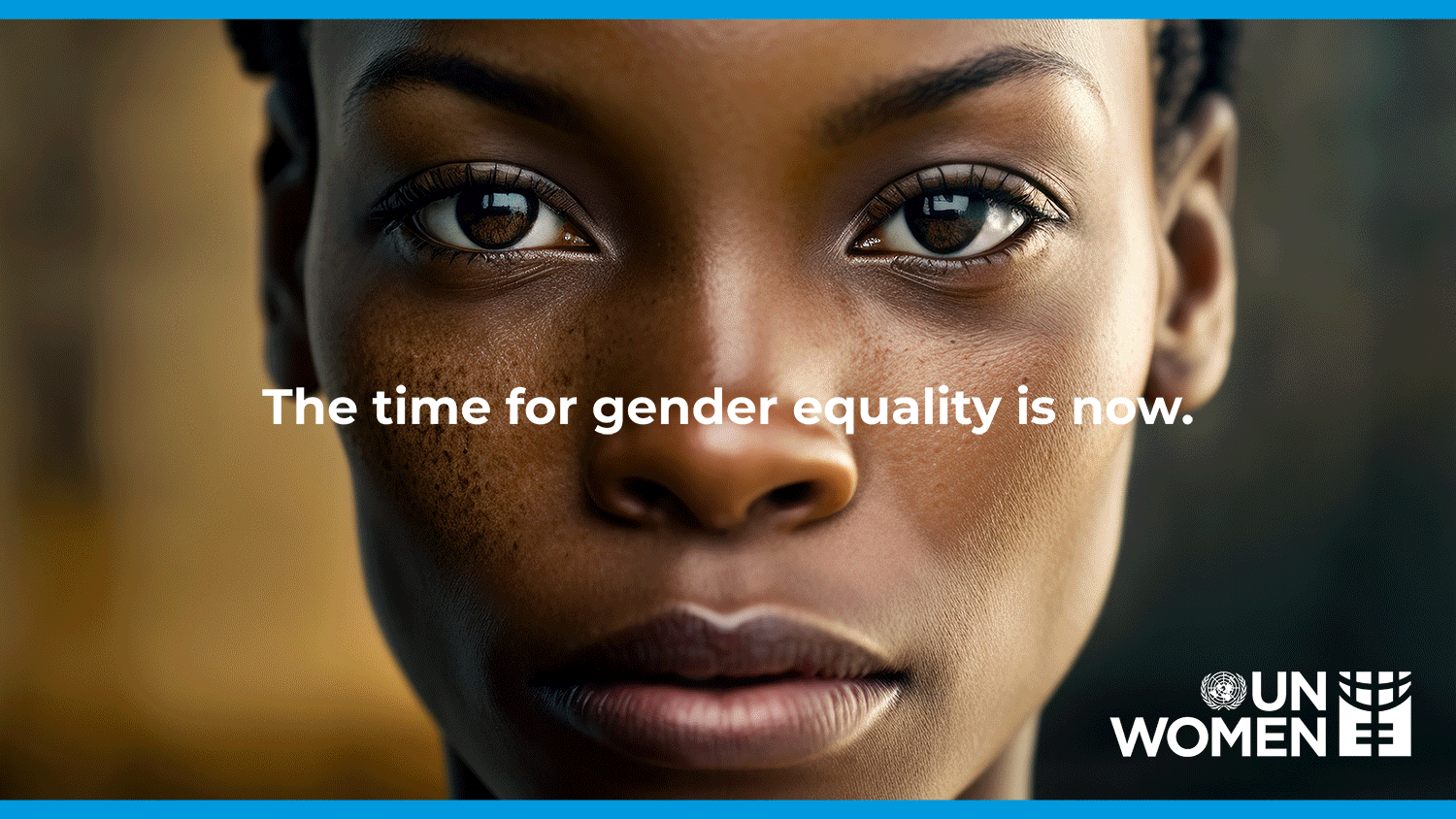
How do you tell the stories of women and girls that are facing a world with increasing gender inequality without causing more harm to those you mean to help? The campaign features twenty women from around the world confronting their oppressors with a haunting stare. While the women's identities have been protected using AI-generated images, their struggles represent those of countless real-life individuals facing gender inequality. As long as women and girls continue to face danger, we must continue to find new and creative ways to help them.


Although the campaign was initially for International Women's Day 2023, it has been adopted by many country offices worldwide and is still running in Sweden, Spain and New Zealand.
FILM CASE STUDY
BAHURA (Reef)
From the Philippines to the world: a VR documentary about healing the sea.

In 2019, I wrote, produced, and directed BAHURA - a five-minute immersive VR documentary shot on location in the Philippines with a 14-person crew under Idea Studio. Bahura, which means “reef” in Tagalog, tells the story of a coastal community’s effort to restore marine life by building an artificial reef in partnership with Rotary International. In the background, you’ll see a drone shot of the reef itself. A replica of the Rotary wheel - over four metres high, 21 metres across, and weighing in at roughly 85 tons. It was massive. And yes, it worked.The film premiered at the Rotary International Convention in Hamburg and was later adapted into nine languages - a major undertaking that extended its reach across Rotary’s global membership. It also served as the anchor experience for the Rotary VR app, a dedicated immersive platform Idea Studio developed to house Rotary’s growing library of VR content.Combining real-world storytelling, multilingual production, and digital innovation, BAHURA offers a powerful, first-person perspective on community-led conservation and the deep ties between people and the sea.
I captured all the stills while on location - juggling directing, interviews on land, and long stretches underwater. Most days were spent below the surface, tracking the reef, the spear fishermen, and the quiet determination of the Atimonanins.Below is a selection of stills from the shoot - giving you a closer look at the people, the place, and the story behind BAHURA.


Two trips to the Philippines and over a year of post-production. Projects like this aren’t soon forgotten - you carry the work, the moments, and the friendships with you. Like this little suckerfish that danced with me for a few minutes, trying to hitch a ride on my fin.
DESIGN CASE STUDY
Muuvment
Brand Identity and Product Design for a social impact software company.
After rebranding the organization and strategically shaping their communications, I then took a creative lead on product design for two unique platforms: The first being a CSR platform with curated video content about world issues linked to powerful action-based tools that enabled measurable and shareable impact.The other was a wellness platform that allowed remote working employees to get personalized support while administrators access statistical data to understand productivity inhibitors for timely business planning.To learn more about Muuvment, watch the brand video that I directed and produced below. And in case you're wondering, Meta's brand logo was launched a year after this one.
GALLERY
Branding
A love of typography and the drive to create smart, lasting work.
This gallery pulls together a broad mix of logo work from national symbols to niche start-ups spanning categories like tourism, nonprofits, apparel, events, and the odd underground oddity. Some are stripped back and minimal; others lean hard into character, era, or attitude. There’s hand-drawn type, modern minimalist, illustrative, heritage, nostalgia and conceptual exploration.Each mark starts with the same question: what truth is this brand trying to signal? From there, the style follows. This isn't about one aesthetic, it's about letting the concept lead and the category shape the expression.


Advertising
This section brings together a mix of award-winning print and poster work - some one-offs, others part of broader campaigns. The projects span humanitarian, inclusion, and public safety messaging, alongside event promotion and other attention-grabbing concepts. Highlights include a street-level campaign for the Vancouver International Film Festival built around ElbowWars, an online arcade game discovered through posters and stickers placed on public armrests. A government initiative supporting those working with at-risk youth, and an infographic created for the Flavour Harvest case study, featuring original illustration by the very talented Skoojah. And last but not least, a national integrated campaign for UNICEF360° represented here by the outdoor transit poster which, based on its fundraising success, eventually went global.


ABOUT BRUCE SINCLAIR
Creative leader. Strategic thinker. Advocate for ideas that matter.
For over two decades, I’ve helped shape some of the world’s most recognisable brands. Today, as founder of Idea Studio, I focus on purpose-driven work at the intersection of brand strategy and design leadership.
The real value of creativity isn’t in what it sells, it's what it makes possible.
Since 2012, I’ve partnered with organisations tackling complex challenges in food, health, the environment and humanitarian initiatives creating work that moves people and drives change.I got my start in the Classical Animation program at Sheridan, and that training still informs how I design, write and direct. Whether it’s a storyboard, a brand system or a campaign, I believe creativity should connect and last.
That's it, for now.
Thanks for checking out my work. I'm making updates all the time so please come back and don't forget to visit Idea Studio or follow me at the links below.